The Good Society is the home of my day-to-day writing about how we can shape a better world together.

A detail from Ambrogio Lorenzetti’s Renaissance fresco The Allegory of Good and Bad Government
The Bare Minimum Budget
This Budget may address some of the consequences of social problems, but it does little to tackle their causes.
The best label for this year’s announcement by Bill English might be the ‘Bare Minimum Budget’. It does the bare minimum to defuse potential political damage in a range of areas – homelessness and health are prime among them – but almost nothing to address the country’s most deep-rooted, systemic social problems. Indeed the Budget hints that these problems may get worse.
There is, in the Finance Minister’s speech, the summary of new initiatives, and the accompanying press releases, no mention that I can see of either poverty or inequality. The government clearly thinks it has dealt with the issue through last year’s $25-a-week increase to beneficiary families, even though that will have only a marginal impact on the issue, since most people in poverty are $100-200 a week short of what they need.
The focus on growth – mentioned ten times in the Finance Minister’s speech – but not on inequality (which is not mentioned once) shows that the government essentially holds to the ‘trickle-down’ line from the 1980s, which is that you don’t need policies for distribution: all you need to do is generate growth and assume that it will somehow end up in the hands of people in poverty. Sadly experience tells us that’s not how it works.
The government would object that the average wage is set to rise to $63,000 a year by 2020, a large jump on its 2008 figure. And that’s to be welcomed, although the median wage will be lower than an average pulled up by CEO salaries.
But figures for labour costs – a slightly technical area of measurement – show that the share of company profits that goes to wage and salary workers is set to decline in coming years. More of their share will be taken by the owners of capital: company owners, investors, banks and shareholders. Since those people are disproportionately well-off already, this is a recipe for growing inequality, and more people missing out on what they need for a decent life.
The government would also object that it’s announced a host of social measures, among which are:
$100m in capital funding for more housing in Auckland
$200m for more social housing in Auckland
$4.2m for low- and no-interest loans to low-income families
$111.5m to support people into employment, including $61m for the Youth Service to help 18- and 19-year-olds at risk of long term benefit use, $26m for targeted case management for 120,000 people on benefits, and $15m for a trial of programmes to improve the employment prospects of prisoners
$20m to help offenders reintegrate
$18m for the Warm Up insulation scheme aimed at 20,000 low-income tenants, and $18m for the Healthy Homes Initiative
$96m for legal aid
$200m for a new vulnerable children service
$50m to reduce barriers to employment especially for people with complex health who would otherwise be on benefits
$43m for children most at-risk of not achieving – 150,000 children with significant time spent in a benefit-dependent family
$50m for better data and evaluation
All of these are welcome, especially the help for offenders. But most only begin to scratch the surface of what’s needed. $200m will get you just another 750 social houses, when there are thousands on waiting lists and 34,000 people homeless in one form or another. $43m for 150,000 at-risk children amounts to $1.80 per child per week, according to PPTA calculations – and there’s no increase in general school budgets, meaning extra costs will be passed onto parents.
The health sector gets another $500m or so a year – but needs $700m a year just to keep up with inflation, according to the CTU’s analysis.
And most fundamentally, this Budget does nothing to tackle poverty and the scandal of over 200,000 children going without the things they need for a decent start in life. Not only is tackling that poverty important in itself, it would have major spillover effects: research shows that boosting family income by $1,000 improves kids’ school marks just as much as $1,000 spent on schools, since parents use the money to help their kids learn.
Instead of fully addressing these poverty-related needs, the government has decided to pay down debt early and float the prospect of tax cuts. The result is a budget that does the bare minimum for political survival, and deals with some of the consequences of social problems – but does little to address the causes of these things.
Revealed: No change in the rich’s income share under National
However, that share is still very large, indicating significant income imbalances.
New data from the IRD show that the share of taxable income going to the richest New Zealanders has not changed under National. However, that share is still very large, indicating significant income imbalances.
The IRD data show that the richest tenth of taxpayers got one-third of all taxable income in both 2008 and 2014. Within that, the richest 1%, about 34,000 people, got over 8% of taxable income.
In contrast, the poorest tenth got just 0.4%.
The income shares are broadly the same in 2014 as they were in 2008. This would suggest that pre-tax inequality has not increased under National. However, the following must be taken into account:
Taxes and welfare payments make a big difference to final levels of post-tax or disposable income inequality, which is the most important measure, and that appears to be rising under National; and
these figures exclude capital gains, which are not reported to the IRD because they are not taxed, and so the figures – in all likelihood – dramatically underestimate the amounts and shares of income going to the richest New Zealanders.
The graph below has more detail. The poorest tenth is decile 1 and the richest decile 10. The 1% are labelled as such.

Tax paid
The table below shows the share of income tax paid by the different deciles. It shows those shares have been stable 2008-14. The shares of tax paid by the richest 10% and 1% are large, as would be expected in a system in which they earn a disproportionately large share of income and taxes are modestly progressive (increasing with income). (The apparent change in shares for deciles 3-6 are largely an artefact of the calculation method and probably not significant.)
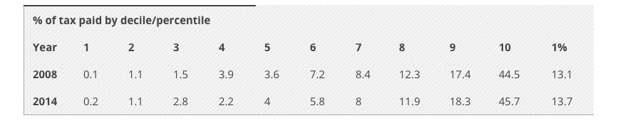
However, it is important to note that these figures are for income tax only, and do not include GST for instance, so they exaggerate the share of total tax paid by the richest New Zealanders. It is incorrect to say that the richest tenth pay 45% of all taxes.
The stability of tax paid seems surprising, given that the 2010 tax changes cut rates for the richest New Zealanders most dramatically. However, moves to crack down on tax avoidance, such as through loss-attributing qualifying companies, may have had some effect on the richest New Zealanders.
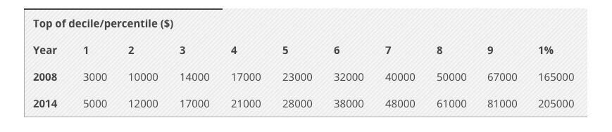
How much does it take to be in the 10%?
The table below shows how much you need to earn, pre-tax, to be in each decile or tenth of taxpayers. The top of decile 5, which is the middle of New Zealand, earns $28,000. To be in the richest tenth you need to have more than the top of decile 9, which is $81,000. To be in the richest 1% you need at least $205,000 a year.
Sources
These figures come from the IRD and can be found at http://www.ird.govt.nz/aboutir/external-stats/revenue-refunds/income-distrib-individual-customers/income-distrib-individ-customers.html.
I thank CTU economist Bill Rosenberg for checking my calculations (and for doing the earlier work that inspired this piece of analysis), although any mistakes remain my responsibility. The 2014 data are provisional at this stage, though any changes are extremely unlikely to alter the high-level figures quoted above.
Revealed: how the government ‘defused’ inequality
Last year’s Budget may have taken a huge amount of heat out of inequality as a political issue, but it may not have changed the long-term pressure.
New data show how the government’s Budget last year took a huge amount of heat out of inequality as a political issue – though it may not have changed the long-term pressure very much.
A previously unpublished poll by UMR shows that the proportion of people listing poverty and inequality as ‘the most important problem facing this country’ fell from 30% just before the 2015 Budget to 20% by late last year – a fall of one third.
This is backed up by figures in the Roy Morgan issues tracker, which displays a similar fall.

This isn’t all the government’s doing: partly what this picks up is people getting more concerned about the state of the world economy, dairy prices and so on, and privileging that over inequality.
But the sharp fall also strongly reflects the way that the 2015 Budget’s key announcement, a $25-a-week increase in benefits for households with children, has convinced a lot of people that the government is ‘doing something’ about the problem.
People who have spoken to ministers say they think they have now ‘defused’ the issue. The move may also explain why, as Brian Easton noted earlier this year, Stuff’s list of political issues to watch out for in 2016 ignored poverty and inequality. With the issue having receded so much by the end of last year, it would have been tempting to write it off.
But UMR’s polling shows concern about poverty and inequality picking up again since late last year and approaching previous heights. As indeed it might. While the $25 increase was welcome, most families in poverty are more like $100-200 a week short of what they need to afford a decent life for them and their children.
Experts such as Prof Jonathan Boston described the 2015 Budget move as having a ‘marginal’ impact on poverty, and this polling suggests the public may ultimately agree. The government’s move has protected them cleverly: it may even be enough to stop voters from deserting them on that issue. But such temporary inoculation doesn’t make the issue go away in the long term. Defusing the issue now is not the same as defusing it for ever.
Is Labour really going to deliver a UBI?
Having a “debate” on something that won’t happen very much runs the risk of looking indecisive.
In news stories this week, senior Labour politicians have suggested they are open to a “debate” on the idea of a universal basic income, a no-strings-attached annual salary paid to everyone in the country.
The basic income has various rationales: increasing human dignity, giving people a base from which to be entrepreneurial, simplifying the benefits system, and, uppermost in Labour’s minds, preparing for a world in which people either change jobs rapidly (and need easy, seamless support between work) or simply can’t find employment because the robots have taken all their jobs.
But is Labour really going to go there? I think not. First, a basic income would be hugely expensive. If you paid each of the 3.5 million adults in this country even a minimal amount, say the $11,000 or so that people like Gareth Morgan have modelled, that would cost $38.5 billion a year, without even thinking about support for children. Paying the basic income at a rate that would keep people out of poverty – that is, at the level of New Zealand Superannuation, around $19,500 a year after tax – would cost $68 billion.
For comparison, we currently spend about $12 billion a year on pensions and $4.3 billion a year on other benefits. So the basic income would be a colossal amount. That’s not to say that it isn’t the right policy, or that there aren’t adjustments, offsets and tax increases you can use to make the cost manageable, but merely that to prepare middle New Zealand for such a policy shift and such spending would take, I think, years of work by a mainstream political party. And Labour has ruled out all the revenue-raising options, like a capital gains tax, that would help fund such a scheme.
Second, you can do much of what Labour is talking about without a basic income. Andrew Little, in one of the stories this week, said: “The question is whether you have an income support system that means every time you stop work you have to go through the palaver of stand-down periods, more bureaucracy, more form filling at the same time as you’re trying to get into your next job.” But if that’s what you want, you could remove stand-down periods, modernise and shift online benefit processes, register everyone in the benefit system when they start work (so that they can move seamlessly from one to another), and so on. You don’t need a basic income.
Finally, another story on this supposed debate claims that the basic income is the same as “the social wage”, and goes on to say: “All Kiwis would be paid a flat income to replace existing social security like pensions and welfare benefits. If a person earns more than the social wage, they won’t get it.”
Now, this is pretty garbled, because the social wage is something quite different; crudely speaking, it’s the dollar value of the free public services people use (which is akin to a wage top-up, hence the term). But the idea that people wouldn’t get the basic income if they earned more than it hints at some kind of claw-back for higher earners.
Assuming that this story represents Labour’s intentions, it suggests that a more likely option is making the benefit system unconditional – that is, you don’t have to be seeking work to get the dole – but not paying the basic income to higher earners. You could argue that that’s a political disaster – since it’s boring, policy-wonk stuff that involves giving some people free money but without the excitement of a full-bore basic income – or smart thinking, since it looks clever and future-focussed without outraging people by giving millionaires ten grand a year.
But either way, it’s not a basic income, nor do I think – from what I hear, and what I feel is politically feasible – that Labour will implement one. I’m happy to be proven wrong, but if not, having a “debate” on something that won’t happen very much runs the risk of looking indecisive, and of raising people’s hopes only to let them down.
Why inequality is such a barrier to eradicating poverty
You may need economic growth to lift people out of poverty, but we need to think about how it will be shared.
In the arguments about how wealth and income are shared out, one of the common lines is that poverty matters, but inequality, in the sense of the gaps across all of society, is a distraction. This is usually buttressed with a reference to China: just look, people say, at the way that hundreds of millions of people have been pulled out of poverty, even as the gap between the rich and the rest has widened. Inequality doesn’t matter; fostering economic growth is the key.
This week’s report from Oxfam – the one pointing out that 62 billionaires have as much wealth as half of the world’s population combined – neatly destroys that argument.
It acknowledges that, between 1990 and 2010, the number of people in the world living below the extreme poverty line halved. But, crucially, it also points out:
Yet had inequality within countries not grown during that period, an extra 200 million people would have escaped poverty. That could have risen to 700 million had poor people benefited more than the rich from economic growth.
The point here is that although countries used some of their economic growth to lift people out of poverty, a disproportionate amount of that growth went to the already rich. Had the growth been fairly shared, poverty would have fallen even more.
The reason that growth wasn’t shared fairly is to do with inequality: the failure to curb monopolies that benefit the wealthy; a lack of bargaining power for workers that sees them unable to claim their share of company profits; weak tax and benefit systems that don’t provide an adequate safety net or recognise the gains everyone gets from public infrastructure; corruption and other ways that wealth influences power. Underlying all that are attitudes about inequality – beliefs that some people are more deserving than others.
So, yes, you may need economic growth to lift people out of poverty; but if you don’t think about how it will be shared, it’s going to be severely limited in its effectiveness. Shared economic growth is a key challenge of the years ahead – and that forces us to think about inequality.
New Zealand not world’s wealthiest country, after all
If something doesn’t seem right, apply your ‘basic common sense’ test, even for well regarded international reports.
A couple of weeks ago, a report from Credit Suisse claimed that New Zealand had the highest median wealth in the world. At the time, I questioned the claim: could the average New Zealander really be wealthier than the average Swede, Australian or Dane? I also thought the figures were well out of line with what my own research was showing.
Turns out I was right to be sceptical. Both the Reserve Bank, whose data the report used, and I got in touch with the report’s authors, and they have confirmed there was an error in the New Zealand figures – due to problems, indeed, with the exchange rate conversion.
The report’s authors have said that the correct figures show the average New Zealander with wealth of around US$252,000, as opposed to the US$401,000 originally quoted. That puts us roughly in the middle of the pack with other Western countries, as one would expect. (And the point remains that those figures are still inflated by our massively over-valued housing market.)
The report’s authors will investigate correcting the online version of the report, and I’ll be contacting the New Zealand newsdesks who have run the story to see if they will do likewise.
The lesson from all this? If something doesn’t seem right, apply your ‘basic common sense’ test, even for well-regarded international reports.
On a related note, for the latest data on this country’s wealth and how unequally it is distributed, you can pick up a copy of my book Wealth and New Zealand from November 9.
Finally, thanks go to the Reserve Bank communications team for following up on this.
Wellington City Council highest earners calculations
WCC has a substantially increased upper salary bill, and the alternative has been open to them to redirect that salary bill increase towards their lowest paid earners.
The Dominion Post is running an opinion piece of mine this morning, comparing the cost of paying the Living Wage to Wellington City Council staff (about $1.7 million a year, on campaigners’ estimates) with the payments for the council’s senior staff in recent years. Below is a spreadsheet with the details of the calculations.
What I have done is take the data from the council’s last four annual reports, which is when they started reporting on the number of staff earning over $100,000. They don’t give exact salary figures for each staff member, in order to protect privacy; instead, they list how many staff members are in the salary bands over $100,000, e.g. $200,000-$280,000.
To come up with the total payments each year to staff who earn over $100,000, I have taken the number of staff in each bracket, assumed they are all earning the midpoint of that bracket, e.g. $240,000 in the example above, and then multiplied the two figures. I have also taken out one of the figures in the top bracket, since that has to be the chief executive and their salary is listed separately. What the figures show is a substantial (30%) increase in both the number of staff earning over $100,000 and the total payments to those staff.
Year Staff on $100k+ Salary bill for $100k+ earners
2011-12 148 $20.4 million
2012-13 155 $21.7 million
2013-14 174 $24.8 million
2014-15 192 $26.8 million
As can be seen, the cost of the Living Wage is about 6.4% of the salary bill for the highest earners, implying that restraint at the top would create ample room for the increases at the lower end.
One question is how much of this increase – about $6.4 million – is an actual increase in pay and how much is just the effect of greater numbers, i.e. people moving up over the line and thus bringing another $100,000 of income into the figures. You can estimate that by taking the increase in staff numbers – 44 – and subtracting the amount they bring into the figures (44 times $100,000 = $4.4 million) from the increase. That leaves about $2 million – still enough to cover the Living Wage costs to the council of around $1.7 million, according to campaigners’ estimates. (Although there will still be pay increases being contributed by those staff, since they are clearly rising in salary, and one could also question the necessity of that number of staff being on or nearly on $100,000.)
Now, it could be that even more of the increase is due to new people coming in (if they were employed in new positions on, say, $250,000). But I’m not aware of that happening at WCC recently; in general, the council has been downsizing, not taking on new staff. And even if that is occurring, it still represents a high pay phenomenon – the employment of larger numbers of highly paid managers – that is a deliberate HR policy. The WCC could take a different policy, that of enabling more staff to be self-managing and flattening management hierarchies, thus eliminating tiers of management and freeing up income to pay lower-paid staff more.
Either way, the point remains that the WCC has a substantially increased upper salary bill, compared with even a few years ago, and the alternative has been open to them to redirect that salary bill increase towards their lowest paid earners. And the costs of increases at the lower end are a very small fraction of the highest earners’ salary bill.
Is New Zealand really the world’s wealthiest country?
Does anyone who has been overseas think that we are wealthier on average than the Swedes? The Dutch? The French?
Reporting on the latest Credit Suisse Global Wealth Report has repeated its claim that New Zealand has the second highest average (mean) wealth in the world – and the highest median wealth.
But is that true? It sits oddly with personal experience. Does anyone who has been overseas, or seen other countries depicted, think that we are wealthier on average than the Swedes? The Dutch? The French? The Canadians? The Norwegians? The Australians? It seems unlikely.
The only possible explanation, for me, is that our figures, if they are correct, are being bumped up by our massively overvalued housing. And the figures do seem to be taken from the Reserve Bank’s household balance sheet, which includes the value of housing. In which case, this measure of wealth isn’t perhaps the most useful (in a popular context, anyway), since it is just capturing the size of our housing bubble.
More fundamentally, though, I’m not sure the figures are correct. They claim household wealth in New Zealand is US$1.3 trillion, around NZ$1.9 trillion, but the relevant Reserve Bank figures seem to indicate a much lower figure around NZ$1 trillion.
The report claims the median wealth in New Zealand is US$182,000 – nearly NZ$270,000. But the 2010 Survey of Family Income and Employment, analysis of which I’ve recently been involved in, puts median individual wealth at about a third of that figure, and I can’t imagine it has tripled in a few years. Next month I’m publishing a book, Wealth and New Zealand, that will bring these figures – and more – into the light.
The Credit Suisse report also takes its figures for the distribution of wealth from a survey in 2001 – now 14 years out of date, and not even the most up-to-date survey available to the report’s authors.
I’m hoping to talk to the report’s authors and puzzle some of these things out, but until then, I would take its conclusions with a grain of salt.
No, Mr English, housing costs are not a key cause of inequality
Just because housing costs are making inequality worse doesn’t mean they are the main driver, or even “significant”.
A little while back, Finance Minister Bill English gave a speech in which he claimed that “poor urban planning is one of the significant drivers of inequality.” His logic is that bad urban planning drives up the cost of building new houses, limiting supply and thus causing rents to rise sharply and house prices to skyrocket. This effect is felt most strongly by the poor, who pay more of their income on housing costs, and so it widens income gaps.
Leaving aside whether urban planning is really to blame for the housing crisis, these claims are part of a wider government argument that housiijmng is a key driver of inequality – an argument they make, sceptics would say, because it’s an area they happen to be taking action in already. Now, it’s true that, as English says, “the gap between incomes measured before housing costs and after housing costs is growing. Housing costs are becoming a larger proportion of incomes – and that matters the most at the bottom end of incomes among people who have few choices.” So it’s good to see the government recognising this fact.
But just because housing costs are making inequality worse doesn’t mean that they are the main driver, or even “significant”. Running the numbers on this, which I’ve just got around to doing, makes the point. The 2015 Household incomes in New Zealand report shows that in 1982, someone just on the edge of the poorest tenth of the country had housing costs of $4,200, on income post-tax of around $15,000.
By 2013, that same person had housing costs of $7,300 on around $17,700 of post-tax income. So housing costs are clearly a massive issue for poor people, consume a large chunk of their income, and have increased for them by around $3,000 in 30 years. (And, the maths show, have left poor people poorer than they were 30 years ago, despite all the promises of economic growth and so on.)
But housing costs have increased at the richer end a little bit as well, so in the end housing costs by 2013 were widening the rich-poor gap (that is, pulling the poor down more than they pull down the rich) by about $2,200 more than they did in 1982. (If that statement isn’t completely clear, well, there’s no simpler way to put it, sadly.) That’s housing’s contribution to increased inequality: $2,200. But in the same period, the overall rich-poor gap widened by nearly $21,000.
That implies that the increased housing cost contributed about one-tenth of the overall increase in inequality in the last 30 years – not nothing, but hardly enough to qualify housing in general (let alone poor urban planning, which is just one part of the housing issue) as “one of the significant drivers” of inequality.
Kiwi Rich Listers’ wealth even greater than thought
These wealthy individuals do have huge variations in their net worth, with sums unimaginable to most of us appearing and disappearing in the blink of an eye.
The combined wealth of New Zealand’s Rich Listers in 2015 turns out to be $57.4 billion, around $2.4 billion higher than initially estimated and a striking 12 per cent increase on the previous year’s figure.
When the Rich List was announced in July this year, the National Business Review (NBR) put the value of its 184 individuals and families at $55 billion. (The cut-off for inclusion is having a fortune over $50 million.)
But when I tallied up the entries for each individual/family listed on the website (as preparation for some data analysis), the total came to $57.4 billion.
The explanation, kindly provided to me by NBR staff, is that there were a couple of late-breaking big revaluations owing to shifts in the New Zealand dollar and other currencies. (Since many of the Rich List hold part of their fortunes overseas, shifts in exchange rates can make a big difference to their net worth.) These revaluations made it onto the website figures but not the commentary or the print version.
The result of this correction is that the year-on-year rise in the Rich List’s value was 11.7 per cent over 2014’s figure of $51.2 billion. That’s a pretty striking increase at a time when Reserve Bank figures show households have in the last few years reverted to going into debt rather than saving, and probably only people who own houses in desirable parts of Auckland will have seen their wealth increase by anything like 12 per cent.
Some would say that such a big shift in value just because of currency changes points to the inherent inaccuracy of the Rich List’s figures. But I think it just reflects the fact that these wealthy individuals do have huge variations in their net worth, with sums unimaginable to most of us appearing and disappearing in the blink of an eye.
And it’s worth noting that Thomas Piketty, one of the world’s foremost experts on wealth, uses such surveys in his work and believes they help “impose some discipline on public debate”. Certainly the fact that the Rich List’s value has (once adjusted for inflation) risen from $12.6 billion in 1986 to $57.4 billion today is a useful one to know, and gives us a sense of how much fortunes have increased at one end of the scale (even as debt has increased at the other).